
Coated paper finishes affect more than the look of a printed sheet. Gloss, silk, and matte surfaces change how light reflects from the page, how images and solid colours are perceived, how comfortable text is to read, and how readily handling marks show. They can also affect the risk profile for folding, varnishing, laminating, foiling, embossing, and writing on the finished item.
There is no universal ranking in which one coated finish is simply better than another. A gloss brochure may suit image-led promotional work viewed briefly under controlled lighting. A silk grade may be a practical choice for a catalogue combining product photography with substantial copy. A matte surface may support a quieter visual treatment or reduce distracting reflection in a document handled under varied lighting.
These terms are broad market categories, not standardised performance classes. A sheet described as silk by one supplier may not have the same gloss, smoothness, bulk, stiffness, or coating formulation as another supplier’s silk grade. Select the named grade, basis weight, print process, and finishing sequence—not the finish name alone.
What a Coated Paper Finish Changes
Coated papers have a layer of coating pigments and binders applied to one or both sides of the base sheet. This produces a more controlled printing surface than the underlying paper alone. Coating can influence smoothness, brightness, ink interaction, printability, and visual appearance, as described in Fujifilm’s overview of coated paper types.
For a print buyer or designer, the relevant question is not whether coating is present, but what the selected surface changes in the finished job:
- Reflection and glare: A more reflective surface can make highlights and dense images appear more visually emphatic, but can also reflect overhead or daylight sources into the reader’s line of sight.
- Image appearance: The surface affects how the printed image is seen. Ink, toner, screening method, drying or curing conditions, and viewing light all contribute; do not attribute the result to paper finish alone.
- Text reading: Reflection can matter where copy is dense, type is small, or the item is read for an extended period.
- Tactile character: Surface sheen and smoothness shape the perceived feel of a brochure, cover, menu, insert, or pack component.
- Handling and conversion: Fingerprints, scuffing, rub, fold cracking, set-off, and adhesion of later finishes must be evaluated on the actual construction.
The coating also interacts with the chosen print technology. Offset ink, digital toner, inkjet ink, UV ink, water-based coatings, varnishes, laminating films, and adhesives do not behave identically. A paper merchant’s swatch book is useful for initial selection, but it cannot replace a printed and finished approval sample where appearance or durability is critical.
Gloss: Maximum Visual Impact, More Reflected Light
Gloss coated paper has a comparatively reflective surface. It is commonly considered for image-led applications where photographs, saturated colours, and strong visual contrast are central to the design. Under suitable lighting, the reflected surface can make a printed piece feel vivid and polished.
A gloss grade is often a sensible starting point for promotional leaflets, picture-heavy catalogues, image-led magazines, postcards, and covers. However, that is an application tendency, not a guarantee of superior reproduction. Actual sharpness, colour, ink gloss, and tonal detail depend on the grade’s surface, the press condition, ink or toner system, screening, image preparation, and proofing method.
Gloss also has a viewing trade-off. The same reflection that supports a high-impact appearance may make text less comfortable to read when light sources create glare. This matters particularly for text-heavy pages, documents viewed under office lighting, and products expected to be read outdoors or in changing light.
Handling should be assessed early. Marks, fingerprints, scuffs, and uneven sheen can be conspicuous on a reflective surface, especially in large solid areas or dark imagery. The extent depends on the coating, printed coverage, ink cure or drying, protective finish, handling route, and the way the item is distributed.
Ask the supplier for the named grade’s technical data, including the applicable gloss test method and measurement condition where provided. Within one paper range, apparent similarity does not mean identical surface performance across weights. A heavier cover may have different stiffness, bulk, coating response, or folding behaviour from a lighter text weight.
Silk: A Balanced Finish for Mixed Text and Images
Silk is generally positioned between gloss and matte in visual reflection. It is frequently selected for brochures, catalogues, annual reports, folders, and other work that combines substantial text with images. The aim is usually to retain a smooth coated appearance while reducing the stronger reflected glare associated with many gloss grades.
That middle position can be useful, but it should not become a default specification without review. “Silk” is not a universal technical definition. It may be called satin, dull, velvet, or silk in different markets, and those labels may describe surfaces with materially different gloss and smoothness values.
One supplier’s range, for example, may publish a stated gloss value and PPS smoothness measurement for its silk grade, while another may provide only a descriptive label. Where data are available, compare the figures only when the test method, geometry, and conditions are known. A number from one datasheet is not automatically comparable with an unqualified number from another.
In practical terms, silk is often worth considering when the job has both product imagery and continuous reading: a travel guide, institutional brochure, programme, corporate publication, or product catalogue. It may reduce distracting reflections without producing the deliberately subdued visual effect often sought from matte.
For work involving brand-critical photography, assess a physical dummy and a colour-managed proof or press sample. Review it under lighting representative of the finished item’s use. A swatch examined under a sales-office spotlight may not predict how the publication reads under retail lighting, daylight, or a workplace desk lamp.
Matte: Reduced Glare and a Quieter Surface
Matte coated paper has a low-reflection appearance. It is commonly considered for text-led designs, restrained brand treatments, art-led layouts, and documents that may be read in varied lighting conditions. Reduced surface reflection can make the page appear calmer and can lessen glare from direct light sources.
Matte is not the same as uncoated paper. It remains a coated surface, and its print response, tactile feel, opacity, bulk, and finishing compatibility depend on the particular grade. It should therefore be specified and tested as its own material, not treated as a generic substitute for either silk or uncoated stock.
The visual trade-off is that a low-sheen surface changes the perceived contrast and depth of printed images. This does not mean images are inherently poor or colours are objectively less vivid; it means the printed result is viewed through a different surface reflection. Some designs benefit from that quieter rendering. Others, especially those relying on bright highlights or a highly polished appearance, may need a proof comparison before approval.
Matte grades also need handling and finishing checks. Scuffing, rub, fingerprints, and uneven protective coatings may show differently than on gloss or silk. Dense dark solids, large areas of flat colour, and high-touch applications deserve particular attention. Where the item will be mailed, repeatedly handled, or used as packaging, ask the printer or converter to define the appropriate rub, cure, and handling checks for the proposed process.
Compare the Finish Against the Actual Job
Use the following tendencies as a starting point, not as fixed performance rankings. The named paper grade and the production route remain decisive.
| Decision criterion | Gloss | Silk | Matte |
|---|---|---|---|
| Surface reflection | Usually highest | Usually moderate | Usually lowest |
| Typical visual character | Bright, polished, image-forward | Balanced, smooth, versatile | Quiet, subdued, low-sheen |
| Text under variable lighting | May be affected by glare | Often a practical compromise | Often favourable where glare is a concern |
| Image-led work | Often considered for high-impact imagery | Often suitable for mixed image and text work | Suitable when a restrained image treatment is intended |
| Handling appearance | Marks may be conspicuous on reflective areas | Must be checked by grade and coverage | Scuffing and fingerprints may show differently and need testing |
| Finishing decision | Confirm compatibility on the actual surface | Confirm compatibility on the actual surface | Confirm compatibility on the actual surface |
Before selecting a finish, define the job rather than starting with a visual preference alone:
- Review the artwork. Identify image coverage, large solids, small type, reverses, gradients, metallic inks, and critical brand colours.
- Define viewing conditions. Consider retail lighting, daylight, office use, exhibition lighting, point-of-sale display, or prolonged reading.
- Map the handling route. Include mailing, insertion, binding, shelf handling, repeated use, and any exposure to abrasion.
- Name the production process. State offset, electrophotographic digital, inkjet, UV, or other relevant print technology, together with the intended ink, toner, coating, or varnish system.
- List added finishes. Include lamination, aqueous coating, UV varnish, foil, embossing, debossing, die-cutting, gluing, and writing requirements.
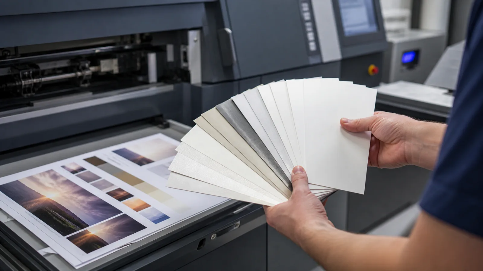
- Shortlist actual grades. Compare weight, caliper, bulk, opacity, stiffness, coating sides, surface data, and availability within the same grade family.
Check Marking, Folding, and Added Finishes Before Approval
A coated paper finish cannot be selected independently from conversion. A visually appropriate sheet can still produce avoidable failures if the printing and finishing sequence has not been checked.
Marking and rub
Ask how the product will be handled before it reaches the end user. A cover carried in a bag, a menu wiped frequently, or a retail insert placed against other printed pieces has different exposure from an internal report. Consider printed coverage, cure or drying time, delivery conditions, and whether a protective coating or film is proposed.
Do not assume lamination is automatically the answer. Film changes gloss, tactile feel, fold behaviour, recyclability considerations, thickness, and the appearance of foil or embossing. It also introduces adhesion and process-control questions. Confirm the film type, adhesive system, and finishing sequence with the printer or converter.
Folding and binding
Coated sheets can crack at folds if fibre strain, ink film, coating, grain direction, scoring, basis weight, folding method, and environmental condition are not appropriately controlled. This is not solely a matte, silk, or gloss issue. A heavy cover with dense ink coverage and an unscored fold may present a greater risk than a lighter sheet with suitable grain direction and scoring.
Specify fold locations and binding method early. For covers, folders, cartons, or multi-panel pieces, request a production-representative dummy or trial that includes the intended print coverage and finishing sequence.
Varnish, film, foil, and embossing
Added finishes should be qualified on the chosen grade. Surface energy, coating chemistry, ink cure, toner type, varnish formulation, adhesive, foil system, pressure, heat, and dwell time can all affect adhesion and appearance. A finish that performs well on one coated sheet may not perform identically on another.
If users need to write on the item, test the actual writing instrument and use condition. Coated surfaces may resist some pens or require extended drying time. Define whether the requirement concerns ballpoint, permanent marker, pencil, stamp ink, or another writing method; “writable” is too vague for approval.
A Short Approval Checklist for Print Buyers and Designers
Use a written approval route that identifies the material and the acceptance criteria clearly.
- Name the paper supplier, grade, finish, basis weight, coating sides, and grain direction where relevant.
- Request the current datasheet and swatch information for the shortlisted grade. Check whether values are given for the exact weight being purchased.
- Confirm the print technology, ink or toner system, screening approach, drying or curing process, and any surface treatment proposed by the printer.
- Review unprinted sheets for surface appearance, feel, bulk, stiffness, show-through, and colour under expected lighting.
- Approve a suitable proof or production sample for critical colour, images, typography, and surface reflection. A contract proof may not predict every press or finishing effect.
- Include folds, binding, varnish, lamination, foil, embossing, die-cutting, and gluing in the approval sample where they are part of the final job.
- Define acceptance checks for glare, colour appearance, marking, rub, fold cracking, legibility, and handling condition at delivery.
- Record what happens if a paper substitution becomes necessary. A replacement should be evaluated against the same criteria, not accepted solely because it has the same finish label.
Choose gloss when the design and viewing conditions justify a reflective, image-forward surface; choose silk when the job needs a controlled balance of imagery and reading; choose matte when low reflection and a quieter surface support the intended use. In every case, confirm the final decision on the named paper grade with the actual print and finishing combination.